-


by
Larry C

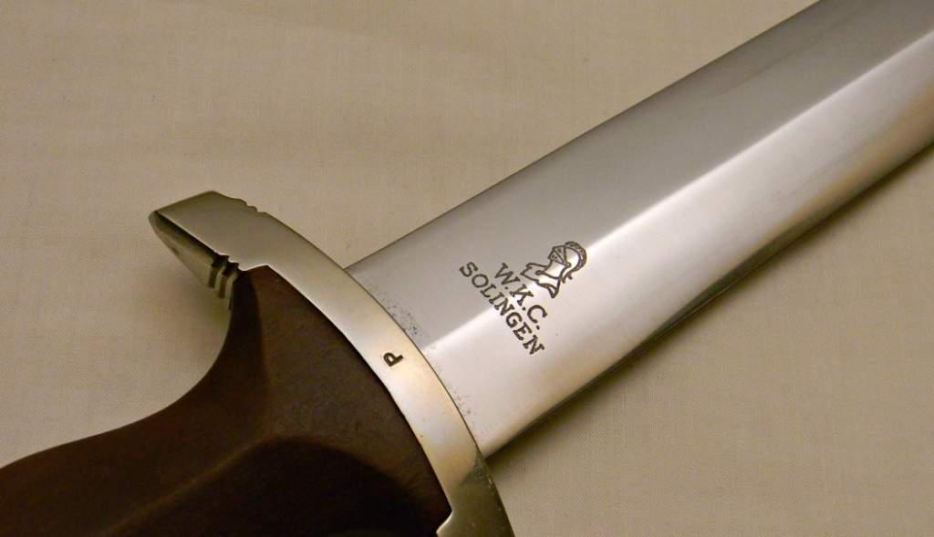
Im a little at odds with the logo compared to the example I once owned and all other WKC SA logos are looked the same as my example.
The example posted by MJM...is somewhat blurry and appears the top of the helmet looks squashed down.
Maybe Im looking at it too hard ?
Thoughts ?
Attachment 1605616
Hi,Larry. I’m still trying to get the hang of the posting and replying thing. LOL! I posted an opinion above with images if you’d be interested in checking out what I see about the 2 logos… I think you were on to something with your post, and your knowledge is always welcome and much appreciated.
Jaime
-
09-26-2022 11:40 PM
# ADS
Circuit advertisement

-
Hello Jaime...there is a difference of opinions on many topics in many threads. A balance can be met through discussion and mainly other observed examples of these logo types.
IMO what as ben observed or what has been commonly seen is my example and one of Daves examples with the gruppe mark P.
As Gerrit pointed out ...it also may be a badly used template.
Seeing the rest of the dagger also helps greatly in details that should be common with one another that would prove what Gerrit states ...these are the questions that we ask when discussing a dagger type.
Regards Larry
It is not the size of a Collection in History that matters......Its the size of your Passion for it!!

- Larry C
One never knows what tree roots push to the surface of what laid buried before the tree was planted - Larry C
“The farther back you can look, the farther forward you are likely to see.” - Winston Churchill


Bookmarks