
Hello everybody!
I do not know what the truth is ....
Thanks for all the help!
Thanks.
Beerneer


Hello everybody!
I do not know what the truth is ....
Thanks for all the help!
Thanks.
Beerneer
Hello Beerneer welcome to the forum. I am very suspicious of this badge. The canted downward legs of the letter M (in RZM logo) vs. typical straight legged design normally seen gives me a bad feeling. Also on the obverse the enamel looks like modern plastic enamel vs glass that would of been used on originals. Modern copy imo. Best regards.
Brian
No sign of pebbling under the enamel either. While it isn't always a surefire sign that the badge is original, it is a characteristic that is very conspicuous in its absence.
B.B.
While I didn't base my sole opinion on the M in the RZM logo I still would like to clarify my observation. There were indeed many variations to the RZM design and the canted leg does appear on period original badges. As BB points out the majority of party badges do have a stippled background, but opaque badges w/o the pebbling do exist. Without clear, more closer pictures of the obverse enamel I still believe it looks a bit on the plastic side, and is somewhat sloppily done; as the black enamel from the swas arm has crept onto the red field near the letter "S" but still not totally damning evidence of a fake. As it stands with provided pictures I would still err on the side of caution. I am however more optimistic and the badge is closer than I originally thought. Pictures of various RZM logo designs from Jo Rivett's party badge book, and a nice non pebbled badge sold by collectors guild I believe? Best regards.
Brian
Another observation is the font/script style of the lettering in the hallmark ges. gesch. The bottom example shown, is from this informative thread posted by Jo some time ago, you can see the minute differences in similar letters indicating a human touch to make the stamping die used to produce the badge as opposed to the O.P. badge which looks very uniform as a machine would make.
RZM and GES. GESCH only on Parteiabzeichen
I would recommend Jo's (micro macro) YouTube video discussing the bund stickpin owned by fellow forum member Aldo as it addresses this observation in detail
Last edited by bsiwula1; 02-11-2018 at 10:36 PM.
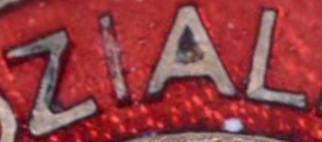
Not a good one . RZM / Ges Gesch marked badges do exist in the realm of the transitional era but this one is wrong ... why ? Look at the horrible Robo Cut fonts on both the obverse and reverse , rounded ends and even lettering , not done by hand but by a modern CNC . The apex of the letter A on the obverse is doubly wide because it is actually two milled lines joining.
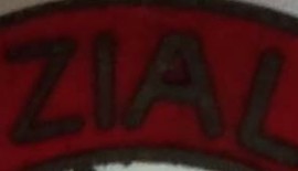
An excellent observation Jimmy! It s a rather smart move by the forgers copying a transitional badge w/o a specific maker attribute M1/..(with no other to compare it to, one could easily be fooled by this piece). The A letter is good tell I overlooked, and am glad you pointed it out! I separated the ZIAL lettering from the original badge posted by Jo (top) and the same letters from the OP badge (bottom) to compare. Kindest regards.by jimmy72

Brian
Thank you Bsiwula , that helps illustrate the point. Always watch for the “robo cut” font but , that being said , M1/13 Christian Lauer incorporates a rounded font style. Once you examine a Lauer the differences of the hand work and the robo cut becomes easily apparent.
Here is Lauer RZM 13 with the rounded font for reference.

Very interesting! I have never seen a fake like this one. They are progressing quite nicely!
Well, if it is a fake it is the best fake i have ever seen. I personally believe it is an original - yes, strangely marked but enamel, traces of wear and pin are correct in my opinion.
Similar Threads
 Posting Permissions


Bookmarks